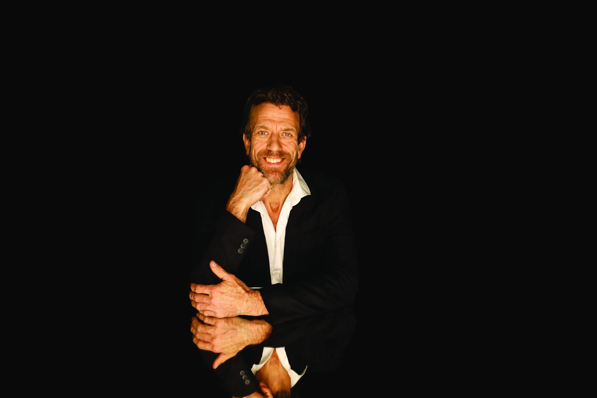

An executive portrait appears in annual reports, board pages, press and conference programs — contexts where the background quietly shapes how a leader is perceived. It is one of the few elements of a portrait you decide before anyone steps in front of the camera, so it is worth choosing deliberately.
The background sets the tone: authority, approachability, context or neutrality. Here is how the main options compare, and how to keep a leadership team looking like one team.
Clean studio backgrounds
A controlled studio background — deep grey, charcoal or a soft graduated tone — keeps all attention on the subject and is the most flexible choice. It matches easily across a leadership team, it is simple to keep consistent over time, and it works in every context from a website bio to a printed report.
It also future-proofs the image. Because there is no specific room or location tying the portrait to a moment, a clean studio background still looks current years later, and new executives can be added in the same style without a visible seam.
The office environment
Photographing an executive in their boardroom, office or workspace adds context and scale. A softly blurred background of glass, timber or a city outlook signals the working environment without competing with the subject.
This approach suits leaders whose authority is tied to their organisation — a managing partner in chambers, a CEO in a head office. The trade-off is consistency: office backgrounds are harder to match exactly across a team and across future sessions, so they work best when the whole leadership group is shot in one visit.
On-location and architectural
An architectural Sydney backdrop — a striking building, a considered interior, a city outlook — can suit a founder or a brand with a strong identity. It gives a portrait energy and a sense of place.
It works best when the location genuinely relates to the business rather than being decorative. A random feature wall adds nothing; a setting that says something about the work adds a layer of story the viewer reads without noticing.
How colour and tone affect the read
Darker backgrounds — charcoal, deep grey, black — read as serious, premium and authoritative. They suit senior leaders, partners and board portraits where gravity is the goal.
Lighter backgrounds — soft grey, white, pale tones — read as open, modern and approachable. They suit founders, advisors and client-facing leaders who want to look credible without looking distant. Neither is better; the right choice depends on the impression the role needs to make.
Keep a leadership team consistent
Whatever the choice, a leadership page looks strongest when every portrait shares the same background approach, lighting and crop. Mixed backgrounds make a team page look assembled from different sources and different eras — the opposite of the controlled, credible impression a leadership page is meant to give.
The practical fix is to photograph the whole team in one coordinated session with a single setup. It is faster, cheaper per person, and it guarantees the set matches. For new starters later, agreeing a repeatable setup means each new executive can be added in the same style without an awkward mismatch.
Related service
Executive Portraits →